Saturday, 13 May 2017
Friday, 12 May 2017
Mise en scene Ressearch
MEDIA TEXT – product which has been produced by a media institution e.g. films, trailers, T.V programmes, music videos, magazines, radio broadcasts, websites, apps and vlogs.
TEXTUAL ANALYSIS – analysis and deconstruction of media texts to understand the messages they contain.
MISE EN SCÈNE – a French term which means ‘what is the frame?’ or ‘what is in the (camera) shot?’. Mise en Scène helps to construct meaning.
Mise en Scène is very important to all representations by showing:
What a character wears
Where the scene is taking place and how it appears
Props signifying information about characters/situation
Lighting connotes certain meanings about characters/situations they are in
KEY:
ICONOGRAPHY – any logos or signage within a camera shot e.g. police officers badge, Starbucks symbol.
KINESICS – movement of a character within a camera frame as a form of non-verbal communication e.g. gestures, movement of a burglar or Gollum.
PROXEMICS – where a character/s is positioned in a camera shot e.g. men placed higher than women, Vine Vaughn and Jennifer Aniston in The Break-up.
SETTINGS – place or type of surroundings where something is positioned or where an event takes place e.g. castle, dark, country yard.
FACIAL EXPRESSIONS – form of non-verbal communication e.g. tough, firm, angry, soft, plain, blank, upset, fearful.
COSTUME – a set of clothes in a style typical of a certain country, culture, event or historical period e.g. knight in armour, bright patterns, leather jackets and white t-shirts, old rags/robes.
LIGHTING – equipment in a room, building or street used to produce lighting e.g. high-key, natural, dark/low-key, reds and orange hues.
COLOUR – reds and oranges/autumn, blacks and greys/dark, pastels, bright/neon, dull/browns
LOCATION – place or position where the scene takes place or where a character is e.g. busy town, dark throne room.
PROPS – objects used in the scene to create setting/use for character
MAKE-UP – cosmetics used to enhance/alter appearance e.g. lipstick, powder, disguise, tan, contact lenses.
Game of Thrones (clip extract)
Q: How is power represented in both scenes?
A: King Joffrey is more powerful than Paul Henry. You can tell this because King Joffrey is wearing a gold, silk outfit which signifies wealth. Also, he wears a crown which suggests a high status and authority. In contrast, Paul Henry is in ordinary modern-day clothes and is sat in a plane room with little belongings of great value which shows that he is a normal person and lacks any significant power. Additionally, King Joffrey is also sitting on a throne which represents an authoritative figure whereas Paul is sitting on a plain, faded, white bed. Furthermore, King Joffrey has a firm facial expression that demands submission from others in comparison to Paul who has a much softer, gentle expression and a slight smile on his face which confirms that he is friendly, approachable and a well-grounded individual that is not in a position of such power and snobbery as King Joffrey.
Improvements on First Draft
In our first draft, there is a lot of shots where the audience can we see that the camera is shaking. We can see this especially when the girl is waking up also when you see the creature behind her. To solve this we need to trim the beginning and ends to parts so, we cannot see the camera shaking. Also, by trimming the shots we are preventing the audience from hearing the camera from when it stops and starts.
Another problem in our opening title is that we an hear the wind an passing cars. This is very distracting and the audience may find it difficult to focus on the opening line. To prevent this we may have to mute the clip but, to make the opening effective, we would add music or sound effects such as dialogue to create a tense atmosphere.
Another thing that we need to improve on, is that in our first draft there is no opening credits. So, at this moment it just looks like clip from a movie, not a opening title. So we will be adding opening credits.
The production has no title so, the audience does not know what the name of the production. Therefore, it is hard to identify the clip to a movie opening.
Another limitation of our opening sequence is that it is too long. The average opening sequence last from a minute to a minute and a half. Our opening is two minutes and eight seconds therefore we need to shorten it by trimming and cutting scenes.
Production Drafting
For our opening scene, we struggled to decide on an ending. Although both options end on a cliffhanger, one version is full of action and the other is more focused on enigma codes.
Option 1 is the more action packed ending with a longer film duration, focusing on the wound and the shadow being evidently present in her room.
Option 2 involves less action however, focusing on enigma codes as you don't see as much after Jenna wakes up - it leaves the audience with a choice to make their own decisions about the fate of the protagonist/story based on what they have just watched.
We took a vote from 20 year 12 and 13 students. 14 out of 20 voted for option 2 but only 6 voted for option 1. Based on the vote we decided to use option 2 as our ending.
Title Font-Vote

Although you cannot see the colours of the generated titles, we chose/offered the options; red, white and black - colours with different connotations... opposites/fight between good and evil (i.e. white & black), blood, innocence, violence, ghosts, demons and death.
Considering voters opinions, we decided to use the most chosen title - option 3 (bottom left) - as it also incorporates all 3 colours that we want to use.
Bibliography
opening titles & credits order - https://en.wikipedia.org/wiki/Opening_credits
- the opening title sequence - https://en.wikipedia.org/wiki/Title_sequence
- virtues of the opening title sequence - http://www.raindance.org/the-virtues-of-the-opening-title-sequence/
- copyright laws - https://www.copyrightservice.co.uk/copyright/p01_uk_copyright_law
- interrogation techniques - http://people.howstuffworks.com/police-interrogation1.htm
- The Shining analysis - http://idyllopuspress.com/idyllopus/film/shining_opening.htm
- backing music - http://www.purple-planet.com/horror-backgrounds/4588158178
- history of film scores - http://www.twyman-whitney.com/film/essentials/music-history.html
Tuesday, 9 May 2017
Monday, 8 May 2017
EVALUATION QUESTION 7
This is evaluation question 7. its an infogrpahic but i learnt a new way to put it in that works alot better
Sunday, 7 May 2017
Saturday, 6 May 2017
EVALUATION QUESTION 5
For evaluation question 4,we have decided to conducted an interview in the format of a podcast. In the interview we will be questioning a person who has some of the qualities be our target audience but is not our ideal member.
Name: Michelle Weeks
Gender: Female
Age: 45
Ethnicity: Black British
Class: Middle
Hobbies: Knitting, Films, Family, Friends, church

Friday, 5 May 2017
Tuesday, 2 May 2017
Soundtrack Options & Choice
Finding appropriate sound effects proved to be a bit difficult at first as many samples did not sound realistic or authentic.

Despite these issues, all sound effects were copyright free and downloaded from YouTube - apart from dialogue "Jenna" used (diegetic synchronous voice-over) because their was more clarity in recording dialogue separately and then pasting it into the scene - finding music instead of creating music was a much quicker process.
The background music (non-diegetic asynchronous) was found on a useful website called Purple Planet where there was a variety of different themed soundtracks to choose from. This made it easier to find suitable music for our production as I quickly found a copyright free piece from SoundCloud called 'Desolation' that was located in the horror section. Although it was found under horror, the slow and gradual incline in volume will create an eerie and intense atmosphere in our opening scene - a sense that something bad is bound to happen.

All sound used (both natural and computer generated, vocal and instrumental) will add layers of tension and a real sense of danger in our production, hopefully helping audience members identify it as a film in the thriller genre - not just a movie clip.

Script
MAIN TASK SCRIPT
INT.Bedroom NIGHT
No Dialogue
EXT. Dream DAY
Birds Chirping
JENNA
(Heavy Panting)
Music Begins
SHADOW
Jenna
INT.Bedroom NIGHT
Alarm Clock Rings
JENNA
Aaah!
(Looking Down At Wrist)
Eer..Aah..Ah
SHADOW
Jenna
JENNA
screams


Film Proposal For The Main Task
Working Title:
Production:
Opening title sequence
Genre:
(Psychological) thriller
Duration:
1 minute 35 seconds
Target Audience:
15-25 (adolescents and young adults)
Director:
Tia Weeks
Editor:
Rachel Fillon-Payoux
Outline:
JENNA (protagonist) is sleeping in the bed of her house, and begins to dream. The dream involves JENNA waking up in in an unfamiliar location - a forest - and decides to look around. JENNA is unknowingly being followed by a SHADOW (antagonist). When JENNA has a hostile/violent confrontation with the SHADOW, she falls and wakes up, still in her bed. On waking up, JENNA and the audience become aware that the SHADOW of her dream, has left a fresh mark on her arm.
Cast:
SHADOW - Ellie D'Sylva
Characters:
SHADOW - a demon attached to the protagonist
JENNA - a young girl who has fallen victim to an evil, pursuing demon
Setting:
The first half includes a shot of the protagonists house but is set in a forest. The second half is set in the bedroom of the protagonists house.
Visual Elements:
Audio Elements:
Equipment:
Props:
Budget: There was no budget planned for this production. All equipment is borrowed. There are no costing effects and actors are volunteers. Two props (eye contacts) cost £8.00 and (cape) £3.00. The total cost is £11.00.
‘An Hour After Midnight'
Production:
Opening title sequence
Genre:
(Psychological) thriller
Duration:
1 minute 35 seconds
Target Audience:
15-25 (adolescents and young adults)
Director:
Tia Weeks
Editor:
Rachel Fillon-Payoux
Outline:
JENNA (protagonist) is sleeping in the bed of her house, and begins to dream. The dream involves JENNA waking up in in an unfamiliar location - a forest - and decides to look around. JENNA is unknowingly being followed by a SHADOW (antagonist). When JENNA has a hostile/violent confrontation with the SHADOW, she falls and wakes up, still in her bed. On waking up, JENNA and the audience become aware that the SHADOW of her dream, has left a fresh mark on her arm.
Cast:
SHADOW - Ellie D'Sylva
JENNA - Chloe Corner
Characters:
SHADOW - a demon attached to the protagonist
JENNA - a young girl who has fallen victim to an evil, pursuing demon
Setting:
The first half includes a shot of the protagonists house but is set in a forest. The second half is set in the bedroom of the protagonists house.
Visual Elements:
- lighting
- camera movement
- editing
- setting
- actors
- props
- costume
- synchronous sound (diegetic)
- vocals
- sound effects
- Canon camera
- SD card
- mobile phone
- tripod
- computer
Props:
- contact Lenses
- cape
- night Dress
- alarm Clock
- Bed
- make-up
Rationale:
This idea was chosen because the majority of our group members enjoy watching the wide range of intricately developed thriller movie plots and sub-genres. We felt that this genre would be the most flexible to experiment with for our production as thriller-based opening title sequences can be structured in various different ways. Also, by presenting our sequence in the form of a dream and featuring an elusive and unknown entity, it adds a fantastical tone - making the audience question their judgement of reality and fantasy - setting us apart from conventional psychological thrillers and the majority of students who would not have likely incorporated another genre into their productions.
Budget: There was no budget planned for this production. All equipment is borrowed. There are no costing effects and actors are volunteers. Two props (eye contacts) cost £8.00 and (cape) £3.00. The total cost is £11.00.
Institution Logo Votes (Results)
A tally was taken of peoples decided 2 logos after they had watched all three video generated logos to make sure we were accurate with results.

Out of the 20 people who voted, the majority chose video logos 1 and 2 as their preferred options. Therefore, we will use these two in the introduction to our opening title sequence.
Institution Logo Voting
My group created 3 logos, however, we decided to use only 2 out of the 3 video generated logos at the beginning of our opening title sequence.
To determine which logos were best to use,we uploaded them unto YouTube for people to use and we asked 20 people to watch and vote on the two logos that they preferred.
The videos above show a few people we interviewed and got to vote.
Video Generated Institution Logos
We though it would be very clear and sophisticated if the font used for ETR Films was simple yet bold, and in 3D rather than 2D. We also merged the logo with its white background as it looked professional and very much like an institution logo you would see in the beginning of an actual movie. Each letter was transitioned to fade in at a given time much like Dream Works Animation.
With Barnhouse Productions, we wanted a lot of focus to be on the picture and sound that would accompany it, however, we didn't want audience members to miss the text. So we decided on an extravagant exit and slow exit. We decided to enter with a zoom and exit with a fade
t
With ETR Productions, we wanted the blocks to appear 1 by 1 and the letters to follow after with a subtle entrance. We thought it would be unique if the text also disappeared in an extravagant fashion. It was decided to enter with a fade and exit wih a spin.


Institution Logo Ideas( Pencil Drawings)


These are the drawings of our initial ideas for our company logo. We will create a computer generated version of this and then turn it into a video logo for the opening credits of our opening scene.
Order Of Credits In Film - Research
Order of Credits In Film
COMMON OPENING CREDITS ORDER:
- (NAME OF THE STUDIO) or (NAME OF THE STUDIO) PRESENTS
- (NAME OF THE PRODUCTION COMPANY)
- POSSESSORY CREDIT/S
- STARRING
- (FILM'S TITLE)
- FEATURING or WITH or ALSO STARRING
- CASTING or CASTING BY
- MUSIC or MUSIC COMPOSED BY or ORIGINAL SCORE BY
- VISUAL EFFECTS PRODUCER or VISUAL EFFECTS SUPERVISOR
- COSTUME DESIGN or COSTUME DESIGNER
- EDITOR or EDITED BY
- PRODUCTION DESIGN or PRODUCTION DESIGNER
- DIRECTOR OF PHOTOGRAPHY
- PRODUCER or PRODUCED BY, EXECUTIVE PRODUCER
- BASED ON THE (BOOK, PLAY, GRAPHIC NOVEL etc.) BY (X) or FROM A PLAY/BOOK BY (older movies)
- BASED ON THE CHARACTERS BY or BASED ON THE CHARACTERS CREATED BY
- (SCREEN) STORY or STORY BY
- WRITER(S) or WRITTEN BY or SCREENPLAY or SCREENPLAY BY
- DIRECTOR or DIRECTED BY
While there are many ways to structure the opening credits, most use some variation of the basic order. In the absence of opening credits, these roles will often be credited in reverse order at the beginning of the closing credits.
Opening Title - Research
Opening Title Sequences - research

When opening credits are built into a separate sequence of their own, the correct term is title sequence (e.g. James Bond). In a film, TV program or video game, the opening titles are shown at the very beginning and list the most important members of the production. They are now usually shown as text superimposed on a blank screen or sometimes on top of action in the show. There may or may not be accompanying music.
Opening credits since the 1980s, if present at all, identify the major actors and crew, while the closing credits list an extensive cast and production crew. Historically however, opening credits had been the only source of crew credits and primarily the cast. Although, over time, the tendency to repeat the cast, and perhaps add a few players with their roles identified (as was not always the case in the opening credits) has evolved.
EXAMPLES:
Many films have employed unusual and fairly elaborate title sequences since the 1930s:
- In several films, the opening credits have appeared against a background of (sometimes moving) clouds. These include 'The Wizard of Oz' (1939), the David Lean 'Oliver Twist' (1948) and the 1961 'King of Kings'.
- In the 1947 Technicolor film 'Sinbad the Sailor', the letters of the opening credits seem to form from colored water gushing into a fountain.

- Since the late 1950s, film title sequences have been a showcase for contemporary design and illustration. The title sequences of Saul Bass and Maurice Binder are among the best examples of this.
- Kyle Cooper's title sequence for David Fincher's 'Seven' (1995) influenced a whole host of designers in the late 1990s. Its aesthetic has "been co-opted almost wholesale by the horror genre as a house style".
- Kenneth Branagh's 'Hamlet' does not actually have an opening title sequence. The only credits seen at the beginning are the name of the production company, Shakespeare's name, and the title of the film. However, the title is shown by means of the camera slowly panning across the base of the statue of the dead king Hamlet, whose ghost will appear in three scenes of the film, and who will play a crucial role in the story.
HISTORY
A while back, most Soviet films presented all film-related information in the opening credits, rather than at the closing which consist of only a "THE END" title.
Their basic methods were also followed in most American films from the 1930s through the late 1980s, though in American films, there was no censoring of the director's name, except in cases of blacklisting. American films also tended to list the names of the actors before the names of the directors, screenwriters, and other principal crew members. Exceptions were made in the films of directors such as Frank Capra, whose name was usually billed before the film's title.
Slowly, title sequences evolved to become more elaborate pieces of film. The advent of television was a pivotal moment for title design because it forced the major film studios to invest in making cinema more attractive in order to win back a diminishing audience.
Part of cinema's new prestigious and expansive quality were orchestral overtures before the curtains opened and long title sequences - all designed to convey a sense of seriousness that was hoped television would be unable to compete with.

There have been several pivotal moments in title design history. The introduction of digital technologies in the late 1980s and early 1990s to film and television changed both industries, and consequently, the 1990s saw a resurgence in title design.
As of the beginning of the 21st century, title sequences can be found in a variety of media besides film and television including video games, conferences, and even music videos.
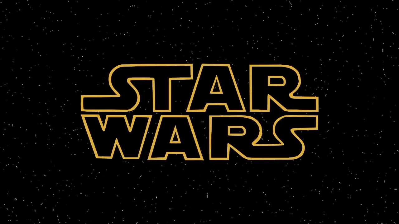 George Lucas is credited with popularising this with his Star Wars films which display only the film's title at the start. His decision to omit opening credits in his films 'Star Wars' (1977) and 'The Empire Strikes Back' (1980) led him to resign from the Directors Guild of America after being fined $250,000 for not crediting the director during the opening title sequence. However, Hollywood had been releasing films without opening credits for many years before Lucas came along, most notably 'Citizen Kane', 'West Side Story', '2001: A Space Odyssey' and 'The Godfather'... Clint Eastwood had omitted opening credits (except for the title) in every film that he has directed since approximately 1982.
The "title-only" billing became an established form for summer blockbusters in 1989, with 'Ghostbusters II', 'Lethal Weapon 2' and 'The Abyss' following the practice.
George Lucas is credited with popularising this with his Star Wars films which display only the film's title at the start. His decision to omit opening credits in his films 'Star Wars' (1977) and 'The Empire Strikes Back' (1980) led him to resign from the Directors Guild of America after being fined $250,000 for not crediting the director during the opening title sequence. However, Hollywood had been releasing films without opening credits for many years before Lucas came along, most notably 'Citizen Kane', 'West Side Story', '2001: A Space Odyssey' and 'The Godfather'... Clint Eastwood had omitted opening credits (except for the title) in every film that he has directed since approximately 1982.
The "title-only" billing became an established form for summer blockbusters in 1989, with 'Ghostbusters II', 'Lethal Weapon 2' and 'The Abyss' following the practice.
TRENDS OF THE 2000s
Many major American motion pictures have disregarded opening credits, with many films, such as 'Van Helsing' in 2004 and 'Batman Begins' in 2005, not even displaying the film title until the closing credits begin.
George Lucas is credited with popularising this with his Star Wars films which display only the film's title at the start. His decision to omit opening credits in his films 'Star Wars' (1977) and 'The Empire Strikes Back' (1980) led him to resign from the Directors Guild of America after being fined $250,000 for not crediting the director during the opening title sequence. However, Hollywood had been releasing films without opening credits for many years before Lucas came along, most notably 'Citizen Kane', 'West Side Story', '2001: A Space Odyssey' and 'The Godfather'... Clint Eastwood had omitted opening credits (except for the title) in every film that he has directed since approximately 1982.
Subscribe to:
Comments (Atom)